The intriguing evolution of a brand through time and space
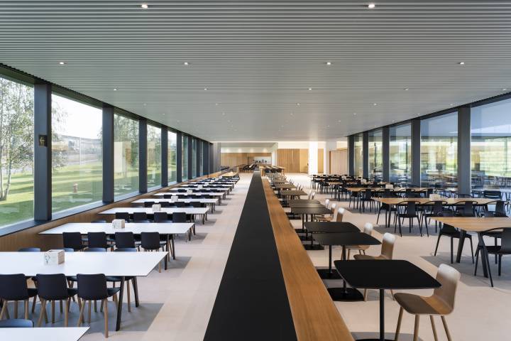
This week we were surprised to read an article in the digital edition of the newspaper 'El País'. The article in question is entitled "Así da de comer Amancio Ortega a los empleados de Zara" and talks about innovative facilities located at Inditex's main headquarters in Arteixo which are pioneering in Europe.
It is a 360-degree canteen concept, which relies on kilometre zero suppliers, takes care of environmental impact, controls food waste and is capable of serving more than 1,600 meals a day.

So far, the news is quite interesting, for it is an example of a future in which it is increasingly necessary to invest in concepts such as ecology and sustainable development.
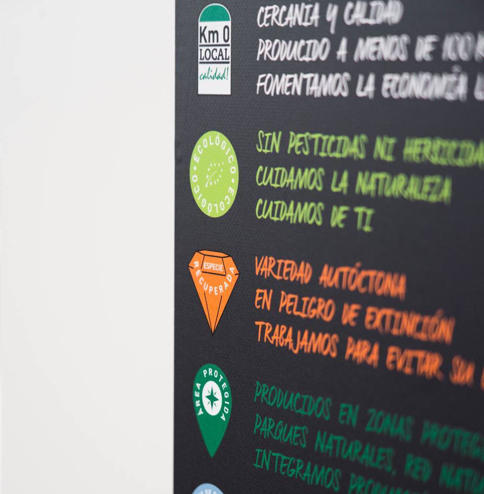
But what has caught our attention and made us smile, is the last of the images that illustrate the report: the photograph of a sign that apparently is inside the dining room and in which you can see a series of icons along with phrases listing the characteristics of the products served to workers.
The first icon of the image represents the products of Km 0, in other words, produced in a radius of less than 100 km, and is a design which was made by eclectick some years ago for the initiative "Km 0 Local Product", promoted by the Consortium of municipalities of Castellón and that tries to boost the agro-food production of the area.

The icon, inspired by the ancient landmarks of Spanish roads, is slightly changed. The original was in Valencian and the one we see in the image is translated and the word "producte" has been removed from the design, but otherwise it is identical.

We loved to see how a design can come alive, evolve and serve purposes that sometimes have nothing to do with its initial function. This is something normal in a fully globalised world, however, it still feels rather surprising when you discover it reading the newspaper on a Sunday morning.
If you're curious to see what the original design looks like, just click on this link.
We hope you like it!
